The Hideout Brand Identity
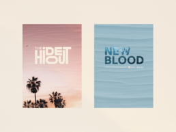
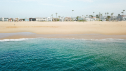
My friends, who make up the band The Hideout, approached me to design their brand identity to launch their debut album, “New Blood,” and get their name out. During our chats, several recurring themes would inevitably always come up: 1) The West Coast plays an influential role because it’s where their roots as a band began, and it’s how they described the vibe of their music. Akin to prime 90s alternative rock from bands like Soundgarden and Stone Temple Pilots. 2) The theme of togetherness resonated amongst them, particularly how they defined overcoming obstacles in life with the support of being there for each other.
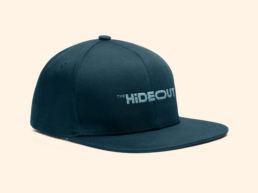
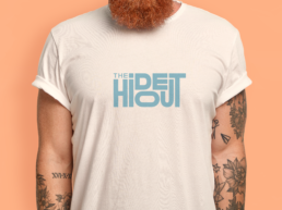
I aspired to create a wordmark highlighting their West Coast beginnings and the tight-knit bond they share.
ClientThe Hideout Agencyn/aRoleart direction
OVERVIEW
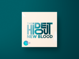
The logo symbolizes the collective drive the band forms when they are together as one. As a whole, they’re greater than any one individual, except for when the drum solo takes over. I designed the logo with specific proportions and spacing, allowing it to feel form-fitting, balanced and interconnected.
COLOR PALETTE
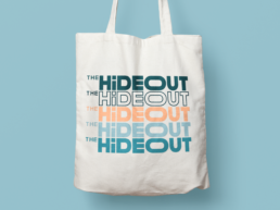
The brand identity uses a complementary palette that is distinctly reminiscent of the West Coast. Cool blues and teal-colored hues are used to portray the Pacific Ocean. They’re contrasted with warm creams and peach-colored hues, evocative of a California sunset on the beach.


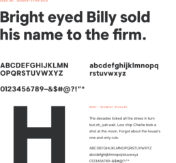
Typography